Beauty is not arbitrary. Whether we're drawn to a nautilus shell, the proportions of the human face, or the clean geometry of a world-class brand logo — there is mathematics at work behind every sense of visual harmony. At IBEE Solutions, we didn't just design a logo. We engineered one — using one of nature's most powerful design principles: the Golden Ratio.
What Is the Golden Ratio?
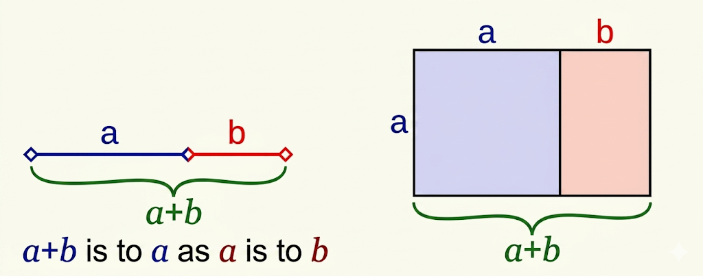
The Golden Ratio (φ, or Phi) is a mathematical constant that has fascinated artists, architects, and scientists for centuries. In simple terms, two quantities a and b are said to be in the golden ratio when:
Golden Mean Formula
a/b = (a+b)/a = φ
The value of φ is approximately 1.6180339887… — an irrational number derived from the Fibonacci sequence (1, 1, 2, 3, 5, 8, 13, 21…), where each number is the sum of the two before it, and the ratio between successive numbers converges to φ.
Known also as the Golden Mean, Divine Proportion, and Golden Section, this ratio appears consistently in nature, art, and architecture — from beehives and nautilus shells to the Mona Lisa, classical violins, and the proportions of the human body. It forms the mathematical backbone of balance and beauty.
####
Golden Ratio in the World's Greatest Brands
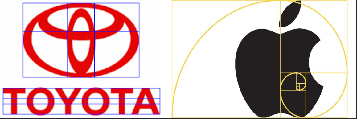
It's no coincidence that many iconic brands — Apple, Toyota, and others — have golden ratio principles embedded in their logos. The Golden Ratio creates forms that feel right without the viewer knowing why. It brings harmony, balance, and a timeless visual elegance that resonates instinctively.
Golden Ratio
####
Engineering the IBEE Solutions Logo
When the IBEE Solutions design team sat down to create a logo, the brief was clear: it had to be beautiful, balanced, modern, and meaningful. The concept centered on the beehive — a structure that itself embodies geometric perfection. Here's how golden ratio mathematics shaped every element:
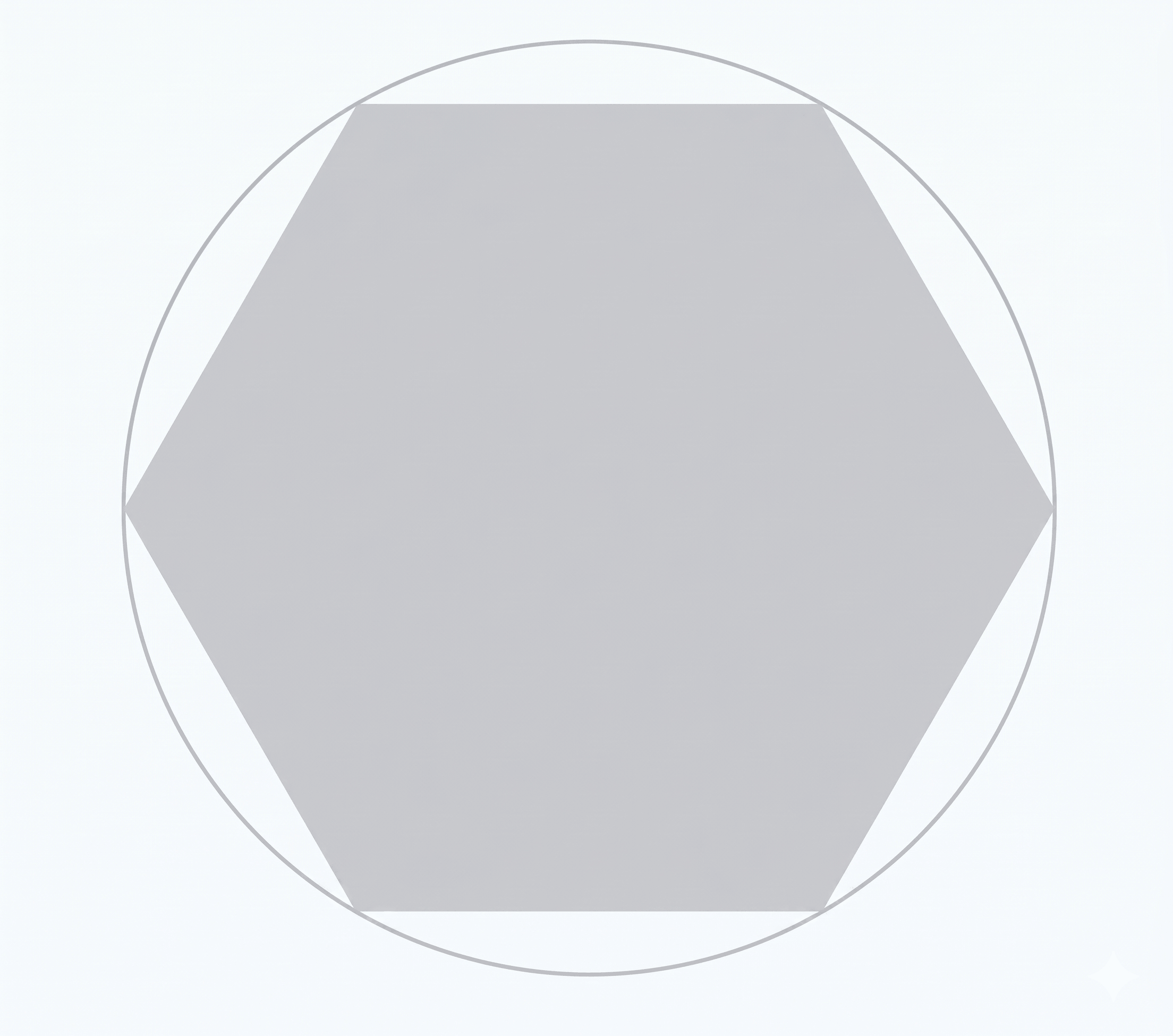
Step 1. The Hexagon Foundation
A regular hexagon was drawn inside a circle, with all vertices touching the circumference. This circle was inscribed within a bounding square of side length X. This outermost circle became the master reference for all proportions to follow.
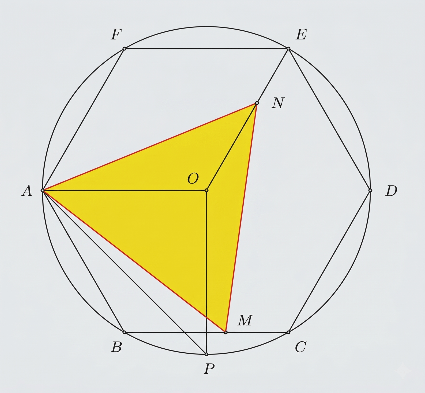
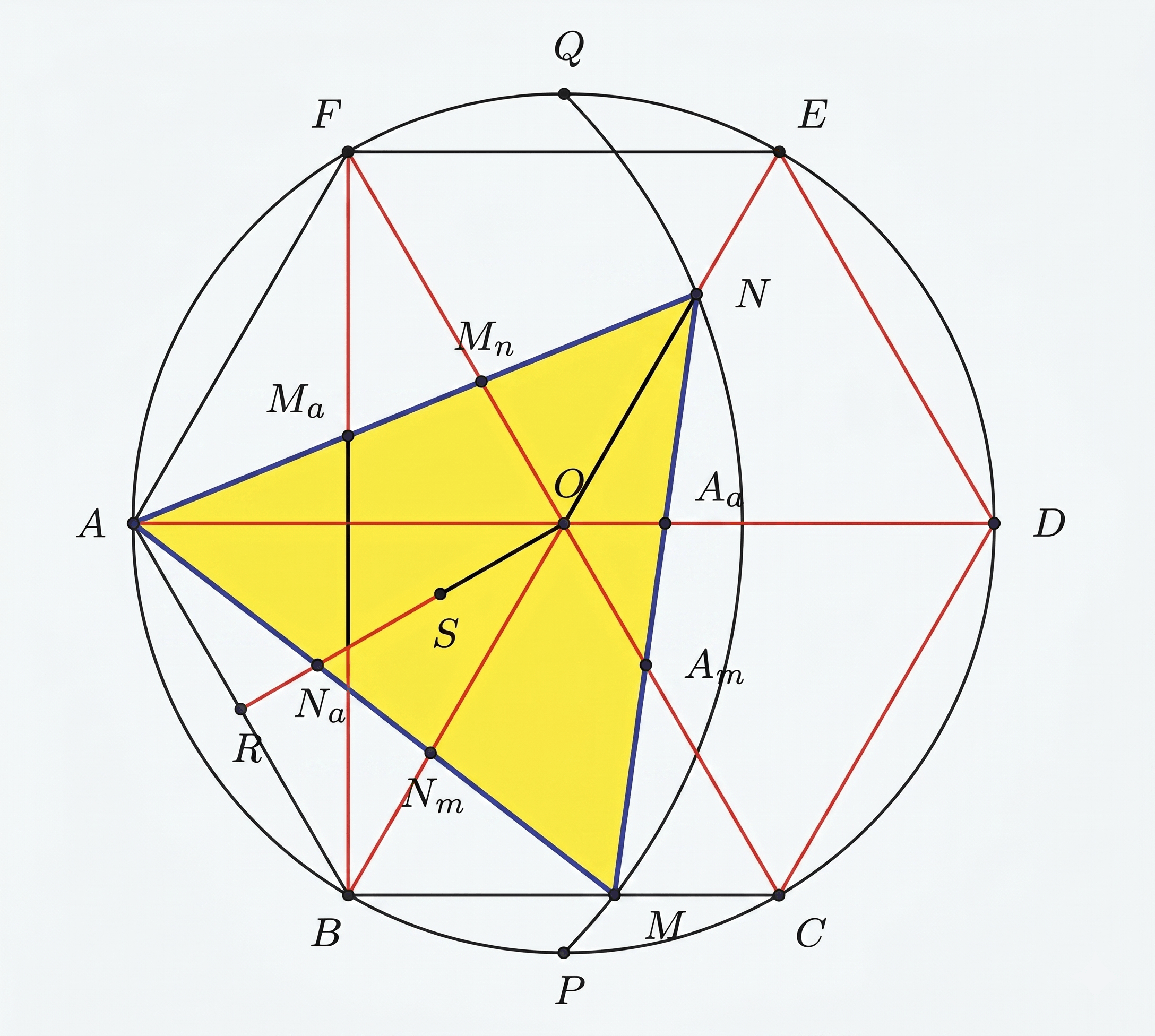
Step 2. Locating the Golden Points
Within the hexagon, golden points were precisely identified using a key property: the area of a regular hexagon ABCDEF is exactly 3 times the area of triangle AMN — if and only if point M divides side BC in the golden ratio. These intersection points guided the internal geometry of the logo mark.
Step 3. Finding the Perfect Spot for the Dot
Inside the hexagon, there are six special "golden points" — positions where lines naturally divide each other in the golden ratio. One of these points, called Nm, was chosen as the centre of the small dot that sits above the letter 'b' (forming the 'i' in 'ibee'). The whole shape was then rotated so the top of the hexagon sat flat and level.
Think of it simply: rather than placing the dot by eye or guesswork, the team used geometry to find the one mathematically perfect position for it within the logo mark.
Step 4. Building the Letter 'b' in Golden Proportions
With the dot's position fixed, each part of the letter 'b' was sized using the same golden ratio — each element a precise fraction of the outermost circle (diameter X). Imagine zooming in five times, each time shrinking by the golden ratio:
- The dot (top of 'b'): the smallest circle — X shrunk by φ five times over
- The outer curve of 'b': X shrunk by φ twice — left-aligned with the dot above it
- The inner curve of 'b': X shrunk by φ three times — sits concentrically inside the outer curve
- The vertical stem of 'b': its width matches the diameter of the dot — keeping everything in ratio
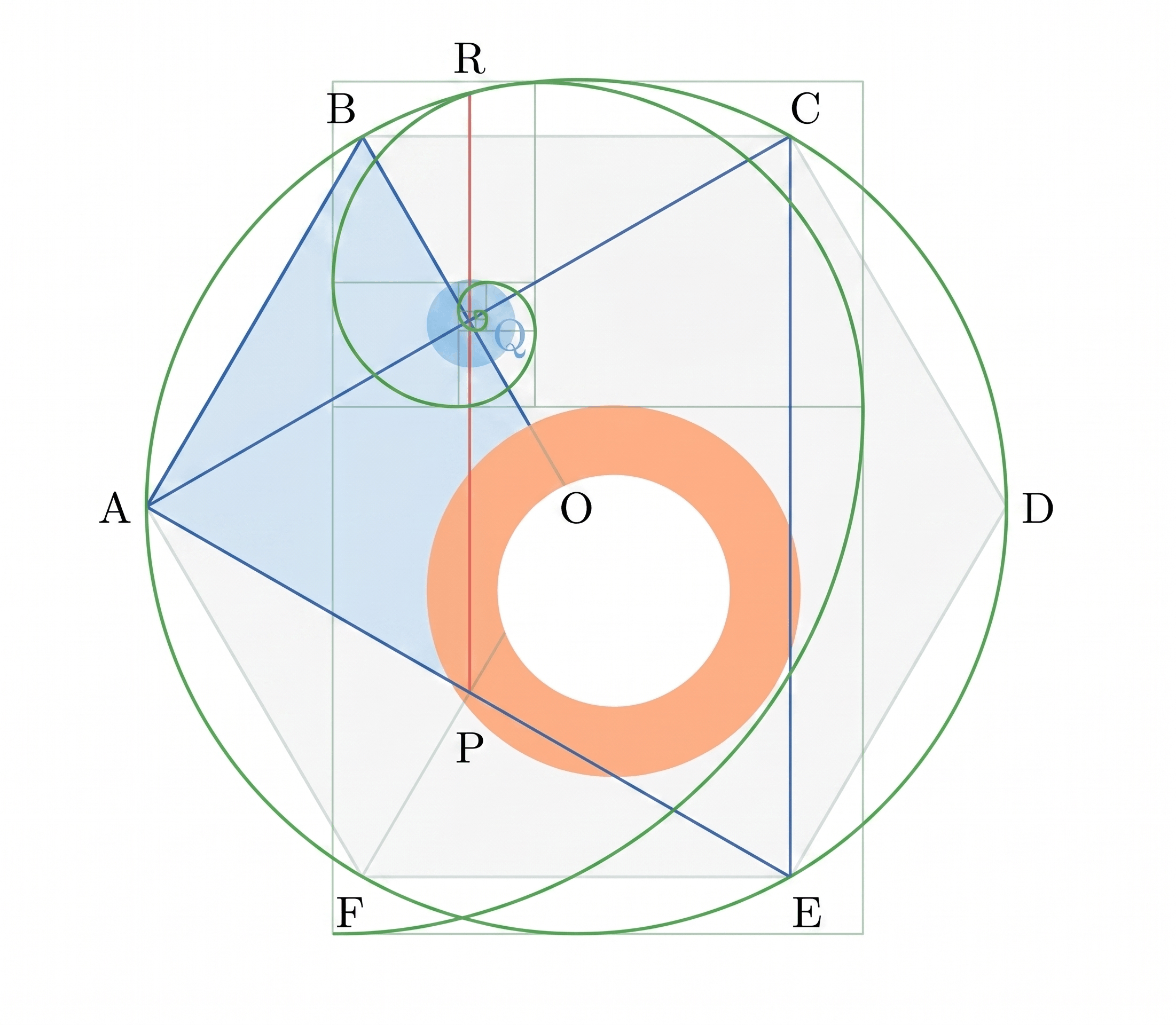
**The result is a letter 'b' where every part — dot, curve, and stem — belongs to the same proportional family. Nothing is arbitrary; everything is connected by φ.**
Step 5. The Metro Design Language
The final aesthetic was influenced by Metro Design principles — clean, light, modern, and content-focused. The result is a logo that feels both timeless and contemporary.

The Result
The IBEE Solutions logo is not just a visual mark — it is a mathematical statement. Every curve, circle, and proportion was derived from φ, making it one of those rare designs that achieves beauty through rigorous intent rather than happy accident.
When you see it, you may not know why it feels right. Now you do.
The Final Logo
The outcome is achieved using the Golden Ratio and on the lines of Metro Design Language — Clean, Light, Modern, Elegant and focused on content.
References
- Golden Ratio in Art — jwilson.coe.uga.edu/emat6680/parveen/grinart.htm
- The Golden Number — goldennumber.net/golden-ratio
- Golden Ratio in Logo Designs — banskt.com
- Golden Ratio in Modern Designs — hongkiat.com
- Golden Ratio in Logo Designs — graphicart-news.com
- Perfect Face & Golden Ratio — goldennumber.net/face
- Perfect Face Golden Ratio Beauty — facethis.blogspot.in